

In this article, I ask the question.
What if you wanted to be a modern day Don Quixote and self-publish research direct to the internet with WordPress rather than through a science journal?
I’ll attempt an answer based upon my own journey in section 2 of this article. First of all, you need some basic infrastructure for publishing suitable figures within WordPress. So I’ll spend some time addressing that issue. For publishing on the internet, you need responsive graphics. There is an overlap between interactive graphics (as discussed below)) and responsive graphics.
But the important difference, as I see it, is that responsive graphics should invite the reader to respond to and participate in the story that you’re trying to tell with the graphic element As described later in this article, the scientific literature is often author-centric. Most researchers would be blithely unaware of the importance of responsive web graphics because they publish their most important work in journals.
The charting plugin that I have been using is wpDataTables from TMS plugins provides for publishing data tables and charts from data sources including databases and Excel spreadsheets. In all 31 different types of charts are offered, though many charts have a business focus. Responsive charts for self-published science remains an immature area of focus for technology providers. This is why the review that follows is important.
The full version of wpDataTables provides a GUI interface for managing your data and optionally allows you to select 1 of 3 of the main graphics engines for web-charting using Google Charts or HighCharts or chart.js. The free version of wpDataTables only offers the Google Charts option.
jQuery(window).on(‘load’,function(){ if( typeof wpDataChartsCallbacks == ‘undefined’ ){ wpDataChartsCallbacks = {}; } wpDataChartsCallbacks[18] = function(obj){ obj.options.series = { // Set line width = 0 (turn off) and replace them with points. 0: { lineWidth: 0, pointSize: 4, color: ‘blue’ }, 1: { lineWidth: 0, pointSize: 4, color: ‘red’}, // Can’t rely on colors set through wpDataChart GUI, so set explicitly. 2: { color: ‘blue’ }, 3: { color: ‘red’ }, } } });A handy feature of wpDataTables is that data sources as CSV and Excel files are stored in the standard WordPress media library. Handy, but risky because I deleted a file accidentally which generated a “WordPress has failed. Contact support” error. Luckily. I was able to delete the offending page (and the chart it contained) through the WordPress admin interface, so to return to normal operation.
An important feature of wpDataTables is that the HighCharts option allows for combining 2-different types of charts into 1 and for a charts to have 2 different vertical axes and scales. Another important feature of wpDataTables is that it features programmatic callbacks.
If you’re not happy with the charts produced then they can be further tweaked through hand-coded javascript entered into a custom HTML field embedded on the same WordPress page. Because wpDataTables uses established graphics engines, comprehensive documentation can be found at the respective websites for Google Charts, HighCharts and chart.js.
The remainder of this review will give an example of creating a chart with wpDataTables and then writing javascript code (see below) to obtain the scientific plot required.
The plot consisted (as shown below) of coloured circles for data points and solid lines showing the exponent fit to the data. A very common type of plot for science studies.
[wpdatachart id=18]
Exponentially fitted data for NSW (blue) and VIC (red) from 16th Dec to 7th Jan.
Excepting that the best plot that I could obtain using wpDataTables is shown in the screenshot from the GUI interface in WordPress below.
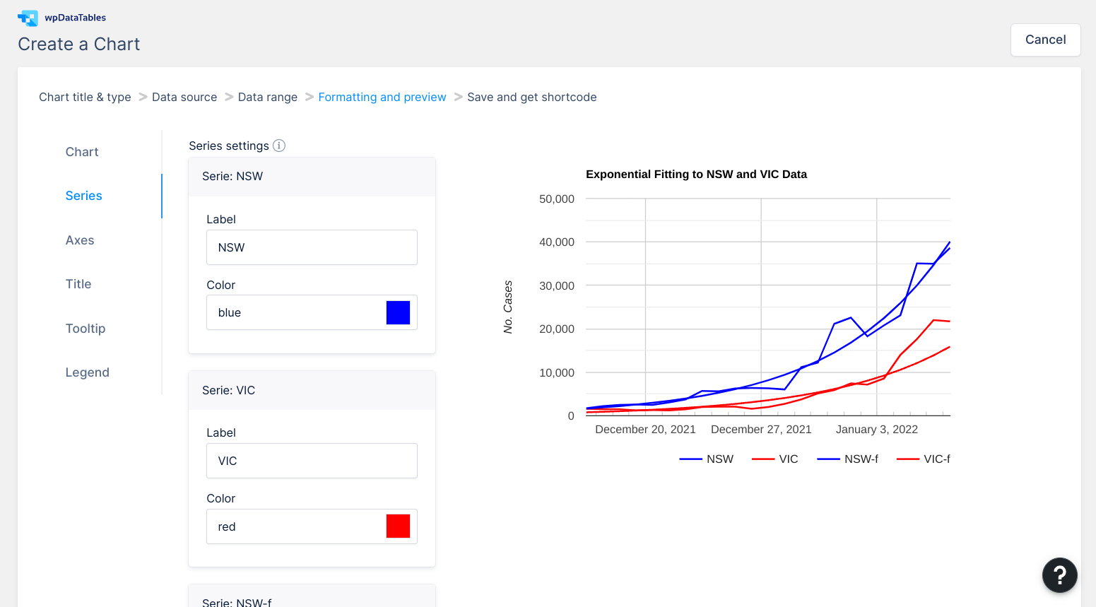
GUI chart design interface for wpDataTables in WordPress.
The plot above created through the wpDataTables GUI is quite close to the desired plot shown above so it should be relatively easy to modify the chart using custom javascript. What is required is to turn off the lines for the observed data and replace the lines with coloured circles. The code developed is shown below.
<script type="text/javascript">
jQuery(window).on('load',function(){
    if( typeof wpDataChartsCallbacks == 'undefined' ){ wpDataChartsCallbacks = {}; }
    wpDataChartsCallbacks[18] = function(obj){
        obj.options.series = {
          // Set line width = 0 (turn off) and replace them with points.
          0: { lineWidth: 0, pointSize: 4, color: 'blue' },
          1: { lineWidth: 0, pointSize: 4, color: 'red'},
          // Can't rely on colors set through wpDataChart GUI, so set explicitly.
          2: { color: 'blue' },
          3: { color: 'red' },
        }
    }
});
</script>
The code above used lineWidth: 0 to turn off the solid lines in the numbered series and pointSize: 4 to display coloured circles instead. Even though the GUI interface shows that the colours have been set correctly it was found, when published, that the colours were unpredictable. Fortunately, some simple lines in the code above were used to set the colour independently of the colour bug found in the wpDataTables GUI interface.
Disappointingly, the HighCharts option in wpDataTables didn’t allow the combining of a line chart with a scatter plot which would have represented a much cleaner solution than the one shown here. Clearly, wpDataTable provides a good solution for simple graphs but has a long way to go before it can be taken seriously as a responsive plotting solution for publishing science articles of any complexity.
Hey, wpDataTables guys. If you need a consultant to help you offer better solutions for scientific graphing — I’m available!
The rest of the article is devoted to setting out my journey from preparing graphs for journals over a number of decades to my current attempts to self-publish science articles on WordPress.
My Journey Toward Self-Publishing in Science: Graphs and Figures
Figures and graphs have been central to any scientific publication. Often, the reception a paper receives in the scientific community depends on how well the figures and diagrams reflect upon the quality of the data and the interpretations of the data made. Most researchers, sometimes through their research institutions, adopt a favoured software system for producing scientific graphs and diagrams,
For many, this included one of the big three mathematical software systems of Matlab, Mathematica or Maple. For me, when I was in that position my favourite was Origin. The big selling point for these commercial software packages was “publication ready“; that’s what you needed to get your work published and respected within the scientific community. More recently, free software has arisen, one notable example being the R statistics system. The R system likewise places great emphasis on producing “publication ready” graphs and charts.
What about Microsft Excel I hear year ask? As well you might because most researchers still use Microsoft Excel internally for preparing graphs for talks, seminars and for external presentations at some lessor known conferences.
Mostly, though, Excel graphs and charts just don’t cut-the-mustard for being “publication ready” for scientific journals.
Interactive Graphics
When scientific publication for the web came into contemporary use, the commercial graphical software company’s started offering options for web-based “interactive” features for researchers to display graphs and diagrams from different 3D viewpoints or perspective views. 4D interactive graphs and diagrams have also become more commonplace (4D can be considered 3D with a timeline).
The interactive graphic below for an Ellis wormhole can be controlled through it’s defining mathematical parameters in the LHS panel, or can be rotated in 3D by selecting the graphic with the mouse or trackpad. Readers might remember this diagram from my article: Physics of Netflix “Dark”.
Note: You’ll need to visit the Mathematica demonstration page to see the interactive features at work.

Still, when it comes to scientific publication 2D is the rule. Researchers submit paper-based copies to journals for some time though now this is done with PDF documents which serve essentially the same purpose but can be exchanged more rapidly between authors, reviewers and editors via email. If you had interactive materials to support your PDF document then these tended to end up in an electronic support materials location separate from the original article. A place called: “electronic support materials” might be seen as a type of purgatory for electronic materials that don’t quite fit the paradigm adopted by the major publishing houses of Elsevier, Wiley and the American Chemical Society, to name just some of the major ones.
These days, the pick of interactive diagrams are used by publishing houses to promote content on their websites. Interactive diagrams are also used by research institutes or by research groups to promote their own activities. A welcome release from purgatory for some of these “electronic support materials“.
Scientific Publication of Graphs and Diagrams is Author-centric.
Publication using the framework outlined in the paragraphs above places heavy demands upon the principal author (usually, the author with the asterisk * next to their name). Being responsible for research papers with print-ready text, equations and diagrams are onerous, even if you were fortunate enough to have colleagues and research students to share the load.
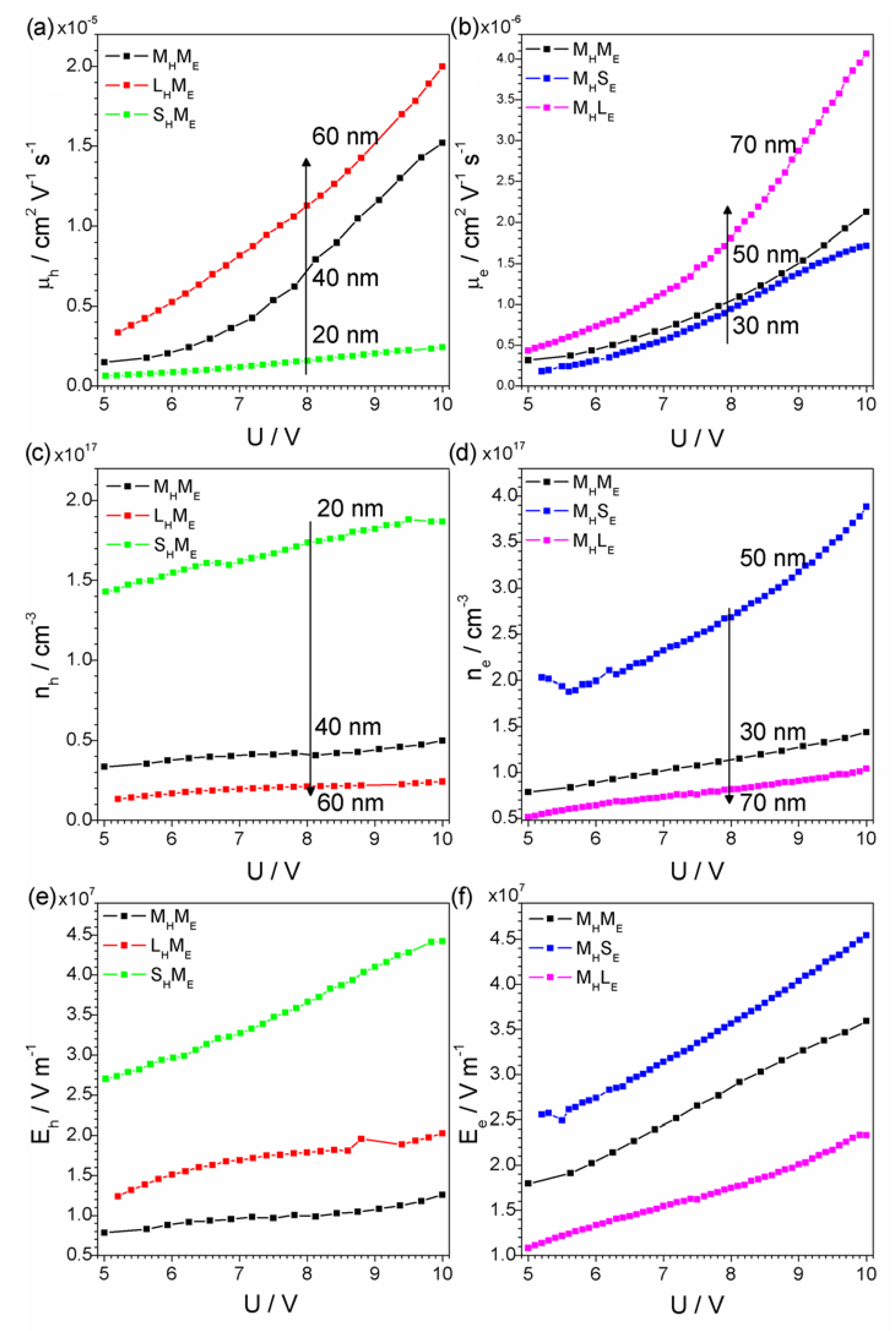
The figure below is reproduced from [1] as an example of the charts that are commonly used in scientific literature. It’s not important to understand the details of the graphs. Reproduced here under a Creative Commons Attribution 4.0 International (CC BY 4.0) license.
Benjamin Nanes [2] has prepared a detailed guide on how to prepare “publication quality” figures, for papers that will retain their quality after they’re accepted and converted to PDF for internet distribution on the publisher’s website.
A useful article no doubt, but it begs the question of why don’t publishers offer authors more assistance in preparing their papers? Particularly in regard to figure preparation?
By most accounts [3], journal publishing is still a highly profitable business despite pressure for publishers to offer open access and to fight the rise of pirating of scientific works through Sci-Hub. Yet most journals only offer a few pages of guidance for the preparation of figures. For instance, Wiley offers the following PDF as guidance for authors.
The truth be known, however, most authors would prefer to keep as much control over their work as they can, even though figure preparation can be onerous. This is despite the fact that they know that copyright to their work will be signed over to the publisher as a condition of publication. Not all publishers require a transfer of copyright but it is still commonplace.
Even if the copyright is transferred, the authors retain moral rights to their work which is important for them to establish reputation and prestige, as well as precedence for claiming new discoveries.
In view of the downsides of scientific publishing, outlined in the paragraphs above, why don’t scientists just self-publish their own work on the internet?
Unfortunately, self-publishing will raise questions about the quality control of the work. The peer-review processes conducted by the Publication Houses are regarded as the gold standard for quality control. If you self-publish, then no matter how good your work is, your perceived, reputation will take a nosedive. There is even the very real possibility that you’ll lose your job because self-publishing is likely not counted in any of the publication metrics that your institution measures. Publish or perish is an as-lived-experience for most researchers.
When researchers publish through journals the publisher is responsible for reaching your audience. If you self-publish then reaching your audience becomes your problem. You’re in the hands Google and social media to spread the word about your work. You’ll need to master the dark arts of SEO (search engine optimisation) to get results with Google.. Your work will likely leave social media perplexed about how to respond.
No wonder I feel like a modern-day Don Quixote in self-publishing articles like Covid-19 Data: Exponential Growth Confirmed.to WordPress.
Conclusions
This article has outlined my journey publishing for journals over a few decades as well as describing the difficulties as I see it with self-publication of research work on the internet. One difficulty is that there is a gap in the existing technology for responsive plotting for science publications in WordPress.
Moreover, there exists a yawning chasm between the culture of the internet and the culture of science. Currently, very little is being done to bridge this chasm.
Open access articles have helped make scientific research accessible to the public and have highlighted the problems that exist about realising the benefits of science to society. These are important issues for both science and the wider community in a time of Covid-19 and climate change.
I have previously written about a dystopian science that serves itself and its administrators rather than the community that largely funds it.
_______
[1] Chulkin, Pavel. 2021. “In-Situ Characterisation of Charge Transport in Organic Light-Emitting Diode by Impedance Spectroscopy” Electronic Materials 2, no. 2: 253-273; published: 8 June 2021; accessed: 16 Jan 2022. Available online: https://www.mdpi.com/2673-3978/2/2/18/htm.
[2] Benjamin Nanes, “How to Create Publication-Quality Figures: A step-by-step guide (using free software!)” accessed: 13th Jan 2022; available online: https://b.nanes.org/figures/;
[3] Ian Graber-Stiehl , “Science’s Pirate Queen”; The Verge, published: 8th Feb 2018; accessed: 13th Jan 2022; available online: https://www.theverge.com/2018/2/8/16985666/alexandra-elbakyan-sci-hub-open-access-science-papers-lawsuit
